As of 2024, mobile devices account for over 60% of global web traffic, and this number is only set to increase from next year onwards.
With Google’s mobile-first indexing now the standard, websites that don’t prioritise mobile experiences are at risk of being left behind. This shift means that a sleek, fast, and user-friendly mobile WordPress website isn’t just a nice-to-have.
However, the beauty of having a WordPress website is that you get to take advantage of the countless plugins, many of which are geared towards making your site more mobile-friendly in half the time.
What’s the Big Deal With Mobile-First Development Anyway?
The answer is simple and clear – mobile devices have become the preferred way for people to access the internet.
Over and above this, users expect fast, responsive, and easy-to-navigate websites on their smartphones and tablets – as does Google.
With Google’s mobile-first indexing, the search engine giant is now primarily making sure that the mobile version of your site meets the necessary requirements.
If your website isn’t optimised for mobile, you risk losing visibility, traffic and conversions.
The Top 5 WordPress Plugins for Mobile-First Development
If you currently aren’t providing visitors with the best mobile experience possible, here are a few WordPress plugins that can help lighten the development load.
1. WPtouch Pro
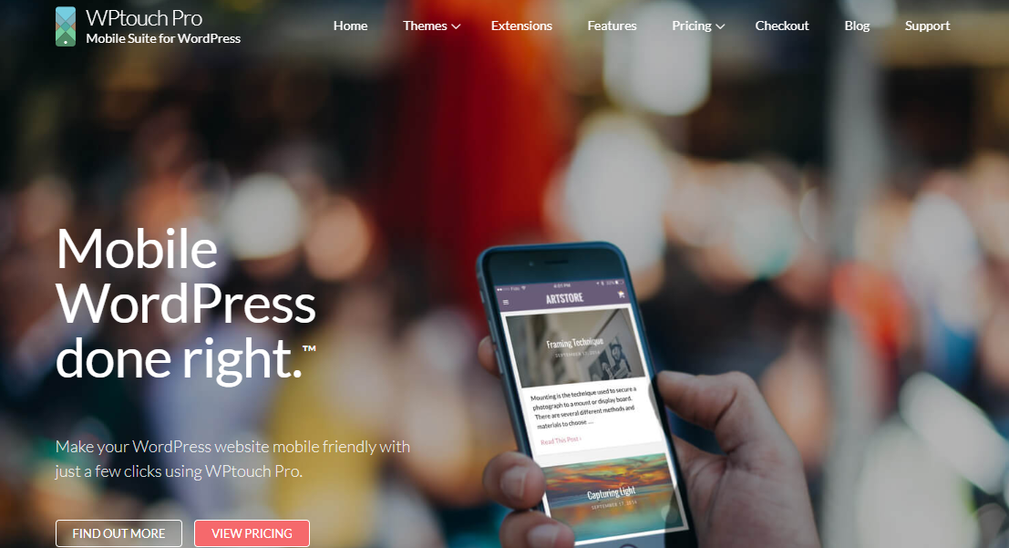
First on the list is WPtouch Pro. This popular plugin offers a simple yet powerful solution for creating a mobile-optimised version of your website. The best part, though, is that it won’t alter your existing desktop design.
WPtouch Pro provides customisable, mobile-friendly themes that load quickly on mobile devices. One of the other standout features is its Google-approved mobile-friendly approach, which is designed to enhance your site’s SEO rankings and overall performance on mobile devices.
It also supports essential mobile-friendly functionalities like touch gestures and mobile-specific caching, which helps to reduce load times and improve your overall user experience.
2. AMP for WP
AMP for WP leverages Google’s Accelerated Mobile Pages (AMP) technology to deliver unbelievable load times on mobile devices. You can easily create AMP-compliant versions of your WordPress site, ensuring that your pages load almost instantly on mobile devices.
The plugin is also highly customisable. This means you can personalise the look and feel of your AMP pages while maintaining the branding and style of your desktop site.
By focusing on reducing unnecessary scripts and optimising resources, this WordPress plugin comes highly recommended for boosting the user experience as well as your SEO efforts.
3. Smush
Images make your site look good, but they can also slow it down, especially on mobile. If your site is image-heavy, Smush is one WordPress plugin you want to consider.
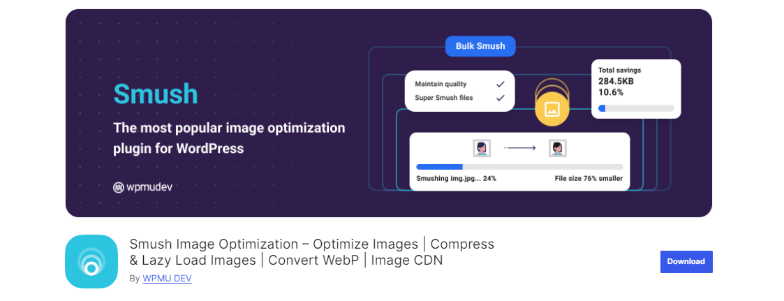
Smush automatically compresses and optimises images without compromising quality, which is important to any developer or website owner. It even supports WebP conversions, ensuring your images are primed for mobile.
Another feature of the plugin is lazy loading. This means images only load as users scroll down the page. This further reduces initial load times and improves mobile performance.
In essence, Smush helps reduce bandwidth requirements for mobile users, leading to a smoother and faster browsing experience.
4. Jetpack
For developers who prefer an all-in-one solution and don’t mind spending a little extra for additional features, Jetpack is an ideal choice.
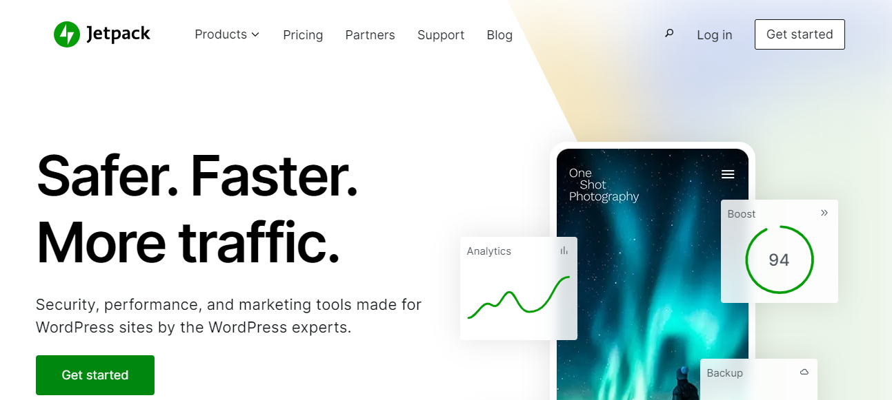
One of its standout features for mobile optimisation is the content delivery network (CDN). The Jetpack CDN automatically serves optimised images and static files, which speeds up page load times for mobile users.
Jetpack also includes lazy loading for images, ensuring that images are only loaded when they’re needed. Then there are the mobile-optimised themes that adapt to different screen sizes – an easy way to enhance the mobile experience for users.
Beyond performance, Jetpack has a number of security features like downtime monitoring, brute force protection and automated backups.
If you choose to go ahead with this plugin, ensure it’s configured correctly or it could impact website performance.
5. WP Rocket
WP Rocket is another impressive WordPress plugin if you want to prioritise mobile-first development in the coming months.
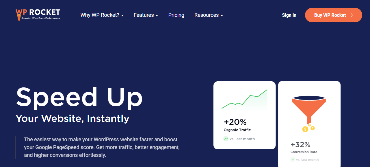
One of its key strengths is page caching, which stores static versions of your pages and serves them to users without your site needing to generate them every time. This reduces load times in a big way.
WP Rocket also includes mobile-specific caching and image lazy loading, ensuring that your mobile visitors experience the same speed improvements as desktop users.
Lastly, the plugin can be used to optimise your site by minimizing HTML, CSS and JavaScript files – recommendations you have probably come across in Google Search Console.
Tools for Testing and Optimising for Mobile Performance
It’s all good and well to use a plugin to get your site mobile-ready, but it’s just as important to test for issues on an ongoing basis.
The best tools to use for this include:
- PageSpeed Insights. If you want to test page load speed, interactivity and visual stability on mobile devices, this is the tool to use. You’ll also receive actionable recommendations.
- Lighthouse. This tool is part of Chrome DevTools and can generate detailed reports covering mobile load speeds, accessibility and mobile best practices.
- BrowserStack. With BrowserStack, you can test your website on real devices with different operating systems and browsers.
Best Practices for Mobile-First Development
Over and above using these plugins and tools, here are a few best practices to keep in mind as you alter your site to be more mobile-friendly:
Responsive Design
- Ensure fluid layouts that automatically adjust to different screen sizes using flexible grids and layouts.
- Use media queries to apply specific styles for various devices and screen resolutions, ensuring a seamless design from mobile to desktop.
Prioritise Content for Mobile Users
- Design with mobile in mind by placing essential content first. Avoid clutter and focus on the most relevant information users need on small screens.
- Use short, readable paragraphs and clear headers to break up content, making it easier to consume on mobile devices.
Optimise Images and Media
- Compress and resize images to reduce load times without sacrificing quality. Use responsive image formats like WebP to serve the correct image sizes based on device type.
- Implement lazy loading to ensure images and videos load only when they’re about to appear in the user’s view, improving initial load times.
Minimise HTTP Requests and Use Caching
- Reduce the number of resources (images, CSS files, JavaScript) that a page needs to load by minimising HTTP requests. This will decrease load times.
- Enable browser caching to store static assets (such as images and stylesheets) locally on the user’s device, allowing faster retrieval of content on subsequent visits.
Fast Load Times
- Aim for under 3-second load times on mobile. Use performance optimisation techniques like minifying CSS, HTML, and JavaScript, reducing the size of code files to speed up your site.
- Consider using Progressive Web Apps or other performance-focused frameworks to ensure your mobile pages load instantly.
Mobile-Friendly Navigation
- Design simple, intuitive navigation for mobile users, such as hamburger menus, which help conserve screen space. Ensure tap targets are large enough to be easily clickable.
- Keep navigation options minimal and relevant to the mobile experience, ensuring users can find what they need quickly.
Touch-Optimised Elements
- Ensure buttons, links, and interactive elements are touch-friendly, with enough spacing to prevent accidental clicks. Use recommended touch target sizes (typically 48×48 pixels).
- Avoid hover effects, as these do not translate well on mobile devices.
Optimise Forms for Mobile
- Simplify forms by minimising the number of fields, and ensure they’re easy to fill out on mobile devices. Implement auto-complete and auto-fill options where possible.
- Use input types that are mobile-friendly, such as number pads for numerical fields or dropdowns instead of free-text fields for easier data entry.
Font Size and Readability
- Use legible font sizes (at least 16px) to ensure readability without the need to zoom. Avoid fonts that are too small or difficult to read on mobile screens.
- Set appropriate line heights and spacing to enhance readability on smaller screens.
Test Across Multiple Devices
- Use tools like Google Mobile-Friendly Test, BrowserStack, and Lighthouse to test how your website performs on various devices and browsers. Ensure it renders well across a range of smartphones and tablets.
- Continuously test and optimise for different screen sizes, resolutions, and operating systems.
Final Thoughts
With the help of these plugins and tools, creating WordPress sites that cater to the growing needs of mobile users is a whole lot easier.
If you need any guidance or assistance in optimising your website for mobile, WP Support Specialists can help. We work with businesses of all sizes by helping them upgrade and improve their websites to provide the best possible experience for all users.
Find out more about our range of services here.


